|
Q. What is the income distribution of the UK? How does the top 1% compare with others?
Q. What is the average household annual income? How has it changed? Q. What is the average household disposable income? How has it changed? Q. What are the trends in income equality? |
SOURCES
ONS - Nowcasting household income in the UK, Release date: 25 July 2018 https://www.ons.gov.uk/peoplepopulationandcommunity/personalandhouseholdfinances/incomeandwealth/datasets/nowcastinghouseholdincomeintheuk ONS - The effects of taxes and benefits on household income, Release date: 20 June 2018 https://www.ons.gov.uk/peoplepopulationandcommunity/personalandhouseholdfinances/incomeandwealth/datasets/theeffectsoftaxesandbenefitsonhouseholdincomefinancialyearending2014 HMRC National Statistics - Percentile points from 1 to 99 for total income before and after tax Published 1 December 2012. Last updated 6 March 2018 https://www.gov.uk/government/statistics/percentile-points-from-1-to-99-for-total-income-before-and-after-tax |
Income Distribution
|
|
In 2015-16, the lowest 1% by annual income, earned on average £10,800 per year, while the top 1% earned £170K on average. There is a fairly even distribution of income up to around 80-90% of the overall population. Then there is a very sharp curve upwards for the highest earners, in particular the top 10%, where annual income before tax is above £45K. Comparing the Before and After Tax graphs, the overall effect is decreasing the income inequality, particularly for the highest earners, with the top 1% dropping from £170K to £114K after tax. |
Comparing the Changing Average Incomes
|
Since 1999, the average income across society has increased above inflation. Between 2004 and 2008, the top 1% (red line) saw the biggest increase in their income compared with the other percentiles. However, after 2009 there was a decrease in the average income of the top 1%, with roughly the same overall percentage increase in their income as the 50th (median), and 75th percentile, after taxes have been applied. |
Comparing Average Incomes in 1999 and 2015
|
|
Comparing the average income of the 5 percentile groups in 1999 with 2015, all groups have seen an increase, however the top 1% stands out as being significantly more than the others. Comparing Before and After Tax, the biggest impact is on the top 1%, where there is a significant drop, but they still have an average income several times more than any of the other groups. |
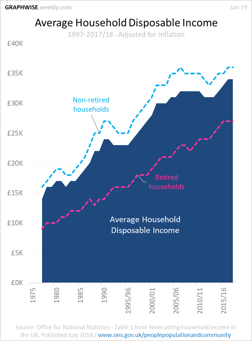
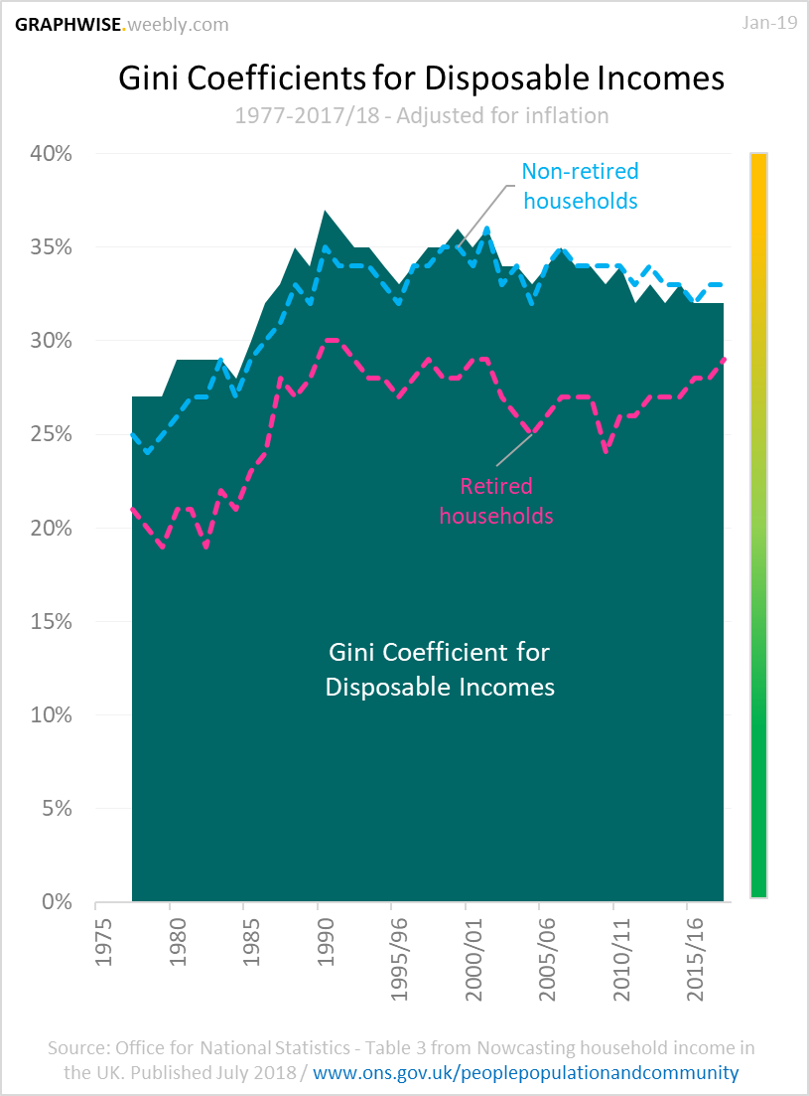
Disposable Income Trends
|
|
Adjusting for inflation, since the 70's, the average household disposable income has steadily increased from approx. £15K to £34K in 2017/18. The Gini Coefficient - a measure intended to represent the income distribution of a nation's residents - had a trend towards less even distribution between 1977 and 1990 but has since shown a trend toward more evenly distributed income, with 32% in 2017/18. |
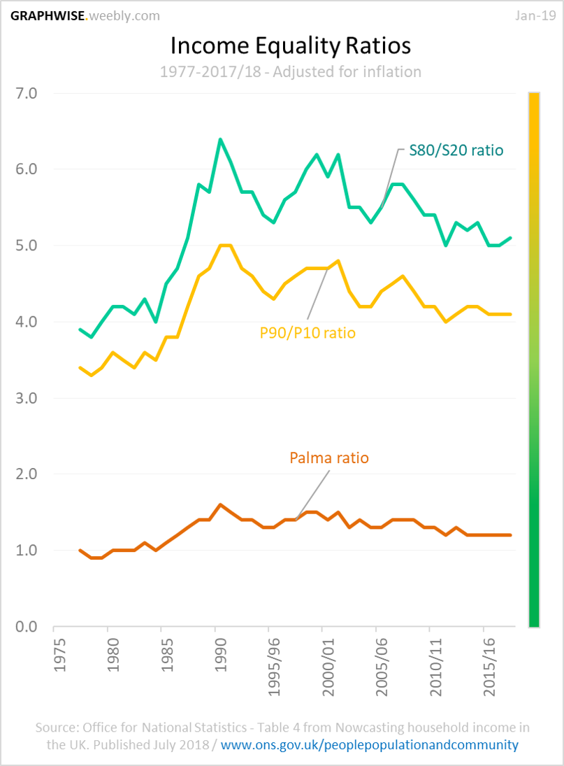
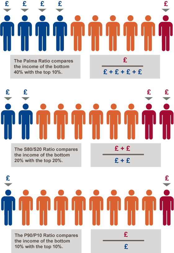
Equality Ratios
|
Since 1990, the 3 equality ratios tracked by the government show a general trend towards more evenly distributed income throughout society. In 2017/18 the Palma ratio was 1.2, which means the 10% highest earners had the equivalent income of the 40% lowest earners multiplied by 1.2. In 2017/18 the S80/S20 Ratio was 5.1, which means the 20% highest earners had the equivalent income of the 20% lowest earners multiplied by 5.1. |
|
